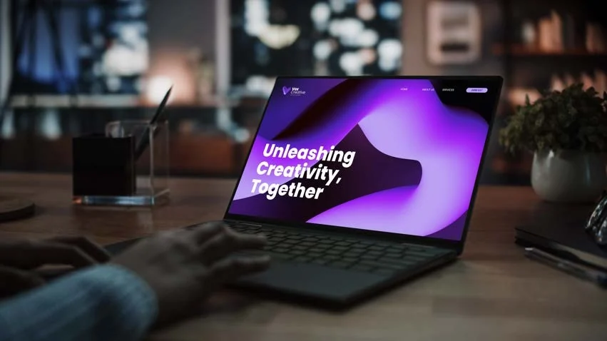
VoxCreative is the creative branding branch of ExpeditionLabs. The brief asked for something collaborative, creative and vibrant, with strong ties to the parent brand, and a lockup reading Powered by Expedition.Labs.
The first round was a set of VC monograms, which read too on the nose, so I steered it toward an illustrative symbol. I used a moodboard to get to a clear direction, then presented two concepts and the client chose the second. The full guide is below.
Brand Identity
March 2024
VoxCreative
How to use this guide
Brand consistency is important for a number of reasons, your brand separates you from competitors and helps your customers understand who you are and what you do. This guide is a tool to help maintain the consistency of your brand identity. It contains the rules and guidelines for your brand and how to apply the visual elements as you use your brand across different platforms.
Brand GuidelinesVoxCreative
01
The brand core, values, personality, goal and solutions.
Brand DNA
Brand Core
VoxCreative is a dynamic creative venture born from the visionary minds at Expedition Lab. At its core, VoxCreative is dedicated to fostering collaboration and creativity in the ever-evolving landscape of content creation and gaming. Serving as the creative branding arm of Expedition Lab, VoxCreative aims to curate innovative initiatives that empower content creators, drive gaming experiences, and engage key opinion leaders (KOLs) within the industry.
Brand Values
Innovation
Collaboration
Creativity
Empowerment
Excellence
Brand Goal
To establish VoxCreative as a leading authority in the content creation and gaming industries, recognized for its innovative solutions, collaborative approach, and commitment to empowering creators and gamers worldwide.
Design Solution
Establish a Strong Visual Identity:
Design a distinctive and memorable logo that encapsulates VoxCreative's core values and reflects its unique personality.
Develop a comprehensive brand style guide outlining the use of colors, typography, imagery, and other visual elements.
Brand GuidelinesVoxCreative
02
The logo system and how to use it.
Brandmarks
Primary Logo
The primary logo is used for most collateral unless there are size or space limitations. The primary logo is supplied in positive and reversed formats and in brand colours.
Minimum Sizing
Horizontal Logo 120px wide digital 30mm wide print
Vertical Logo 40px wide digital 10mm wide print
Horizontal Logo
Vertical Logo
Colour Variations
Colour variations allow the logo to work in different contexts and with different background colours.
Brandmarks
Additional brandmarks can be used throughout the brand and collateral to add variety. They are consistent with the logo, and elements to give the brand a cohesive feel.
Minimum Sizing
Brandmarks 120px wide digital 30mm wide print
Clear Space
For best practice preserve the recommended clear space around the logo to maintain legibility. The clear space for the primary logo is equal to the height of 'X' as a square.
Clear space for the secondary logo is equal to the height of 'X' as a square.
Primary Logo
X't'=X
Secondary Logo
X't'=X
Incorrect Use
For best practice do not alter or distort the logos and brandmarks in any way. Any change, large or small, alters the impact and consistency of your brand and logo. Here are some common mistakes to avoid.
×
Don't rotate, tilt or skew×
Don't change proportions×
Don't use over busy background×
Don't add effects e.g. drop shadow×
Don't replace elements×
Don't crop elements×
Don't outline logo×
Vox CreativePowered by Expedition.Labs
Don't change font
Brand GuidelinesVoxCreative
03
The brand colours and how to use them.
Colours
Colour Palette
Colour is one of the first touch-points of a brand, and to maintain the look and feel a consistent colour palette should be used.
Smoky Black
RGB
24/2/1
HEX
#180201
Blue
RGB
63/36/169
HEX
#3f24a9
Bright Lavender
RGB
187/160/243
HEX
#bba0f3
Blue-Violet
RGB
138/56/234
HEX
#8a38ea
Purple
RGB
160/34/245
HEX
#a022f5
White
RGB
255/255/255
HEX
#ffffff
Gradients
Gradients can be applied to backgrounds, and promotional materials, adding a dynamic and contemporary flair to your visual identity. Striking a balance between creativity and brand coherence, using gradients effectively can help your brand stand out and be engaging in a visually competitive landscape.
#3f24a9#180201#180201#8a38ea
#a022f5#bba0f3#3f24a9#bba0f3#a022f5
Brand GuidelinesVoxCreative
04
The brand fonts and typographic hierarchy.
Typography
Brand Typography
Brand typefaces should be used in all print and digital collateral to keep the brand looking consistent across all platforms. Please note, use the logo typeface sparingly.
Font Access
Poppins can be downloaded from Google Fonts.
Arvo is available through Google Fonts.
Logo TypefacePoppins Extra Bold+Regular+Light
Vox ExtraBoldCreative RegularPowered by Expedition.Labs Light
ABCDEFGHIJKLMN OPQRSTUVWXYZ
abcdefghijklmn opqrstuvwxyz
0123456789
HeadingsPoppins Bold
Aa
ABCDEFGHIJKLMN OPQRSTUVWXYZ
abcdefghijklmn opqrstuvwxyz
0123456789
AccentArvo Regular
Aa
ABCDEFGHIJKLMNOPQ RSTUVWXYZ
abcdefghijklmn opqrstuvwxyz
0123456789
Body CopyPoppins Regular
Aa
ABCDEFGHIJKLMN OPQRSTUVWXYZ
abcdefghijklmn opqrstuvwxyz
0123456789
Hierarchy
Use the recommended hierarchy for consistency and best practice legibility. Give the text and elements plenty of evenly spaced room between for a lighter layout feel.
Sub-heading text
Poppins Medium
Heading Here
Poppins Bold
Lorem ipsum dolor sit amet, consectetuer adipiscing elit, sed diam nonummy nibh euismod tincidunt ut laoreet dolore magna aliquam erat volutpat.
Poppins Regular
Quote or key pullout text
Arvo Regular
Button
Poppins Bold
Brand GuidelinesVoxCreative
05
Brand elements, and images.
Graphic Elements
Graphic Elements
Integrating graphic elements in design is essential for creating visually compelling and memorable brand communication. Whether it's incorporating icons, illustrations, or other visual elements, each graphic should serve a purpose, reinforcing key brand messages or enhancing user experience. Consistency in the use of graphic elements across platforms and materials will establish a cohesive brand identity.
Stock image style
Stock images are a valuable resource in the realm of visual content creation, providing a vast and diverse array of professionally captured photographs that can be utilized across various platforms and projects.
Image Resources
Adobe Express Unsplash.com Pexels.com
Please check the licensing details before using any images.
Brand GuidelinesVoxCreative
06
Brand elements used on socials.
Brand in Use
Twitter
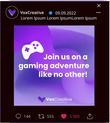
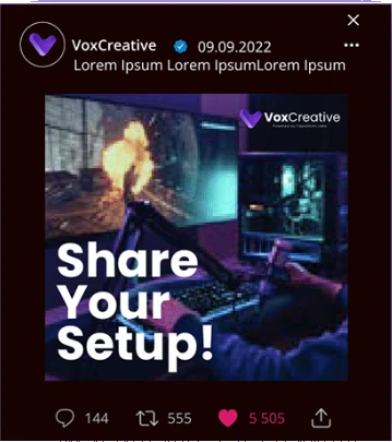
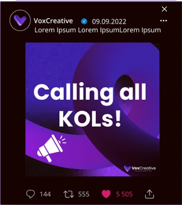
Incorporating elements such as icons, Background or creative overlays can capture the attention of your audience and communicate your brand's personality in a distinct way. These graphic elements serve as visual cues that guide followers through your posts, making your content more engaging and shareable.
Specifications
Post sizing 1600 x 900 px 1080 x 1080 px
Colour mode RGB
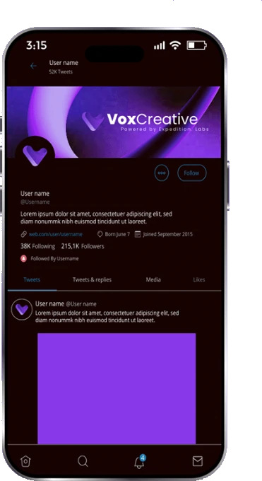
Profile banner
The profile banner has been designed with the 'safe areas' in mind. This refers to the cropped portion of the image when it's viewed on different screen sizes.
Specifications
Banner sizing 1500 x 500 px
Colour mode RGB
The squares indicate the safe area for different sized screens, and won't appear on final artwork.
Website
Adding your brand's graphic elements on a website is fundamental for creating a visually compelling and user-friendly online experience. From impactful hero images that immediately capture visitor's attention to carefully designed icons and illustrations that enhance navigation, these graphics play a crucial role in conveying information and shaping the overall aesthetic.