SPHEREHUB
- Client
- SphereHub
- Role
- Lead designer: brand, website and UX direction
- Tools
- Figma
- Deliverables
- Brand, website, 19 onboarding screens
Brand, website, and a nineteen-screen onboarding flow
Two projects for the same student-housing startup. In 2025, the brand and the website. In 2026, the intake flow underneath them.
Brand & Website
2025 · Three audiences, one platform
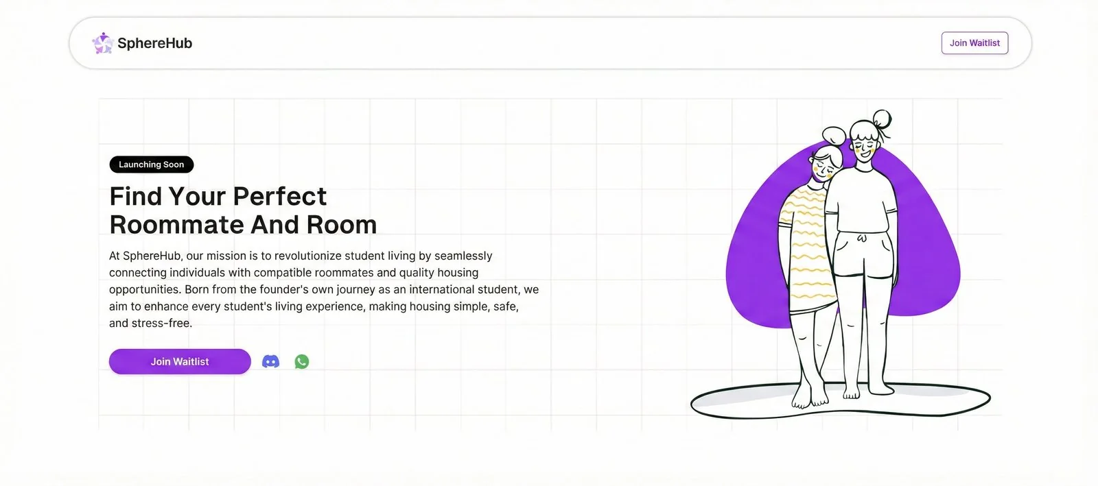
The previous site fell flat
A waitlist page with a stock illustration and one flat purple. It led with the company's mission instead of the student's problem.
Three audiences, one platform
Students, landlords and universities wanted incompatible things from the same page.
Students
Needed to feel safe. Scams, uncertainty and isolation shaped every decision before price did.
Landlords
Needed leads that converted. They were already competing for attention on Zillow and apartments.com.
Universities
Needed proof nobody would get hurt. Liability, student verification and data agreements came before students did.
Each audience was run by a different fear
Students didn't know where to start. In a survey of more than fifty, the search was scattered across WhatsApp groups and word of mouth, and the loudest roommate concerns were trust and cleanliness. One Baltimore property manager had generated four leads in two months on the listing sites he already used.
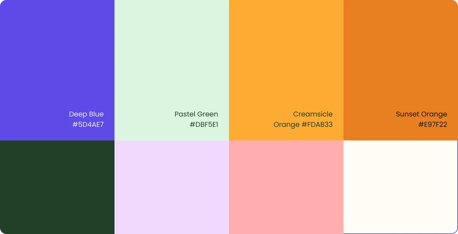
The brand system
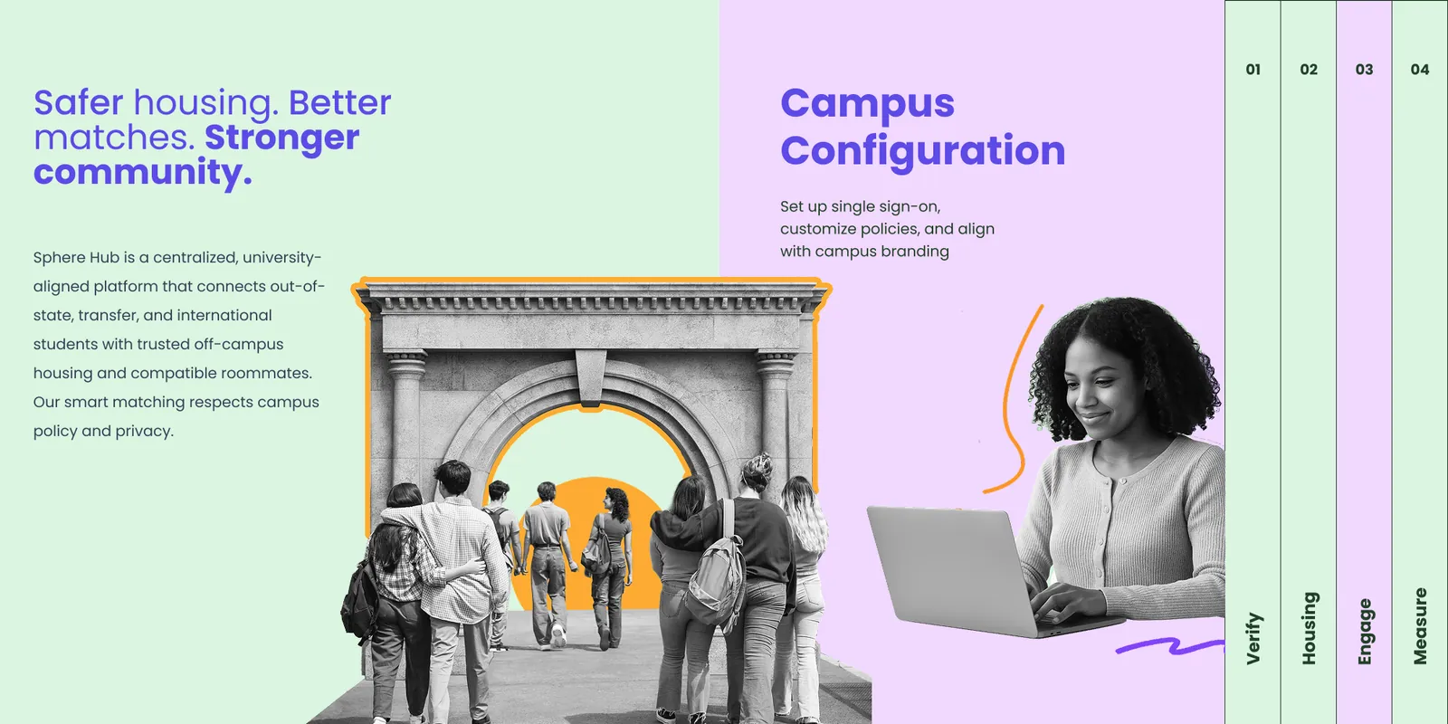
Each audience got its own route through one brand. The palette stayed unusually wide on purpose: SphereHub's students come from everywhere, and a three-colour system would have flattened that. One harmony holds it together, so a landlord page and a student page read as the same company.

The website
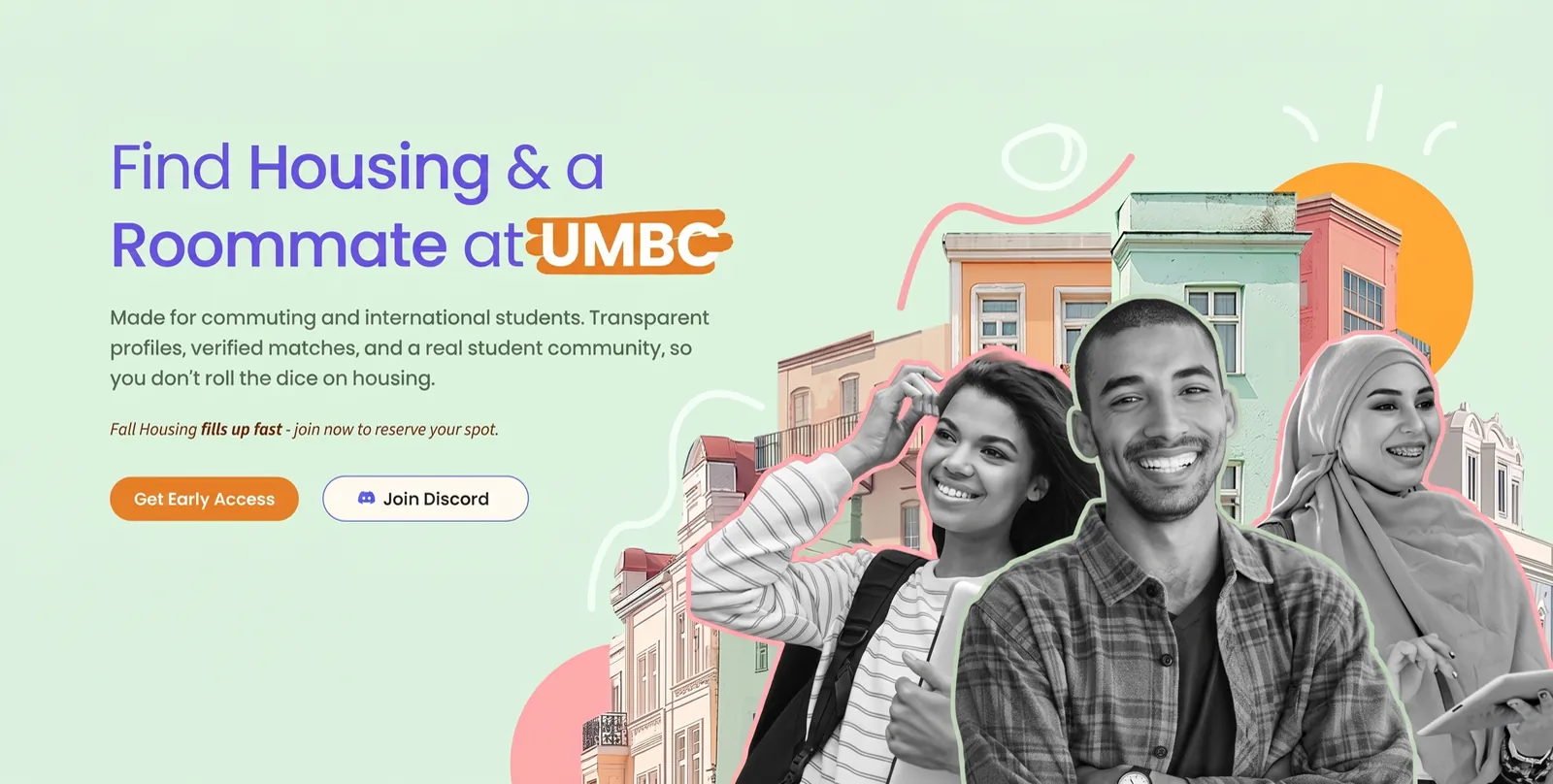
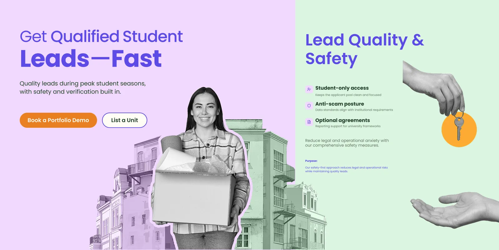
One site, three routes. Each audience landed on a page that answered its own fear before it asked for anything: safety for students, qualified leads for landlords, policy and proof for universities.
The handoff
The rebuild stayed custom code. I closed the project by handing the site to Adil, SphereHub's technical intern, so changes could be made in-house instead of queuing behind an outside developer.
The Onboarding Flow
2026 · They came back. This time the problem was inside the product.
A premium service, a budget-rental feel
The concierge tier promised AI matching plus real human review, aimed at international students on tight housing timelines. The intake never sold that.
"The form is fatiguing. Too many free-text fields. It feels like Zillow." Client review, April 2026
Roommate questionnaire
Tell us about yourself so we can find your match.
The flow was designed for one person
The personas came straight out of SphereHub's own discovery interviews: real demographics, real anxieties.

Amara, 22
Lock in safe, verified housing before term starts, without flying in to view it.
Getting scammed or stuck in a bad lease in a country whose rental rules she doesn't know yet.
Three findings set every constraint
SphereHub's discovery interviews with international students defined what the design had to answer.
Fear of failure runs the show
Housing is high-stakes and unfamiliar. Users weren't optimizing. They were trying not to get burned. Trust had to show up on every screen, not just at checkout.
Name the human, plainly
Users welcomed automation, but only when told where a real person stepped in. In a category built on trust, ambiguity read as evasion.
People like talking about themselves
The intake wasn't boring. Its format was. Dating apps collect far more personal data with almost no typing.
From typing to tapping
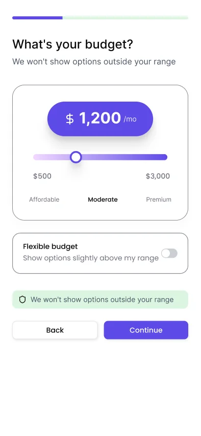
Preparing for an April 2026 working session with the founder, I pulled apart the Hinge and Bumble intake flows. Both collect more personal detail than SphereHub asked for, and both do it almost entirely without text fields: sliders, chips and multiple choice. The questionnaire became a quiz.
Two weeks later, with the wireframes still grayscale, the slider treatment was worked out in Figma across several rounds. I brought in a reference from an AI mental-health app, chosen for how atypical its graphs and sliders were, carried the website's overlapping shape-and-photo language into the screens, and iterated on the files with Pooja until the controls read as playful rather than utilitarian.
Roommate questionnaire
Tell us about yourself so we can find your match.
your space?
rhythm?
These screens are live. Drag any slider, or use the arrows to change which is in front
Answer the question before it's asked
If fear drives the user, reassurance can't wait for a privacy policy. Every screen says why it's asking, and what happens to the answer.
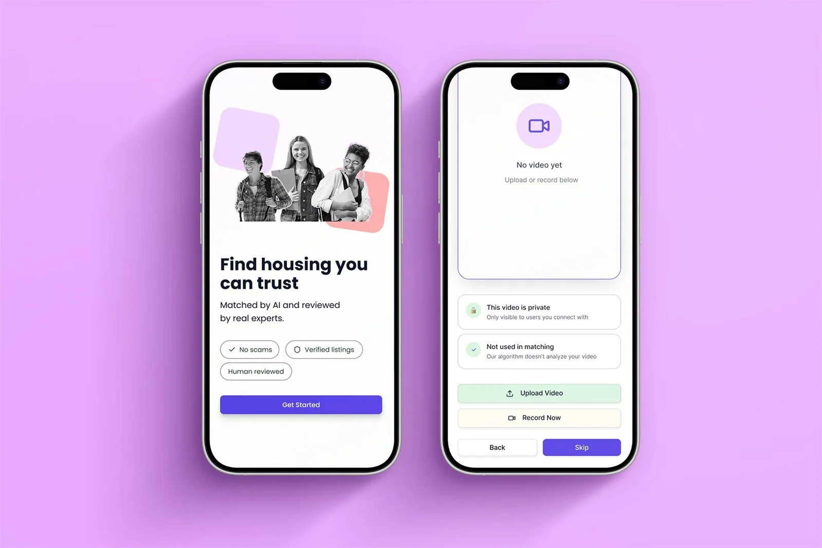
The welcome screen states the model outright: matched by AI, reviewed by real experts. Three plain markers back it up. No scams, verified listings, human reviewed.
The video intro is the sharpest case. Recording yourself is a big ask, so the screen answers both worries on the spot. It's private, and the algorithm never analyzes it. After client review the optional label was boxed and made unmissable. A recommendation should never read as a requirement.
Human review takes time. So say so.
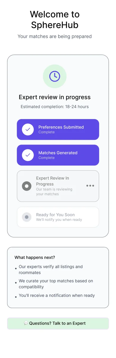
Expert review meant up to a day's wait, in a category trained on instant results. Rather than hide it, the flow makes the wait legible, and turns it into proof that a real person is involved.
An honest estimate
A clear 18 to 24 hour window, not an endless spinner. Under-promising beats a progress bar that lies.
Staged, not blank
Four visible stages borrowed from package tracking. Completed steps stay checked, so the wait reads as motion.
Delay reframed as value
"What happens next" shows what the reviewers are doing, turning the pause into proof of the service they paid for.
A person, one tap away
A persistent route to a human closes the loop on the promise made at screen one.
Nineteen screens,
end to end
Welcome, preference capture, an optional intro, results, and expert review.

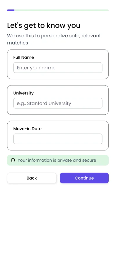
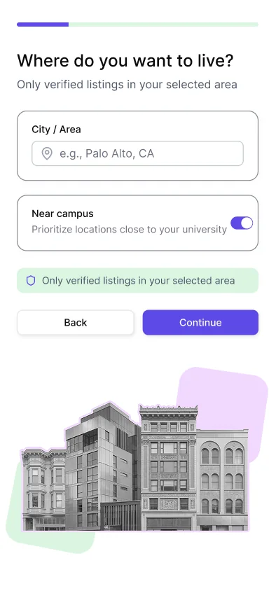
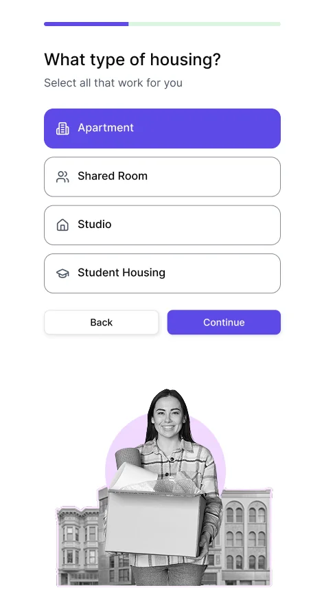
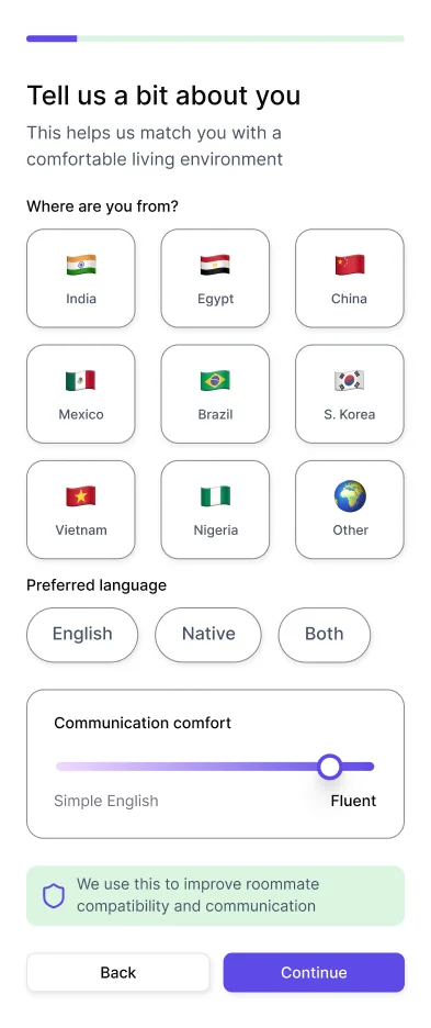
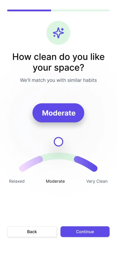
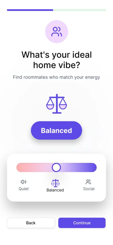
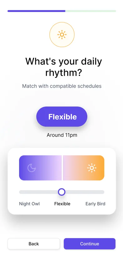
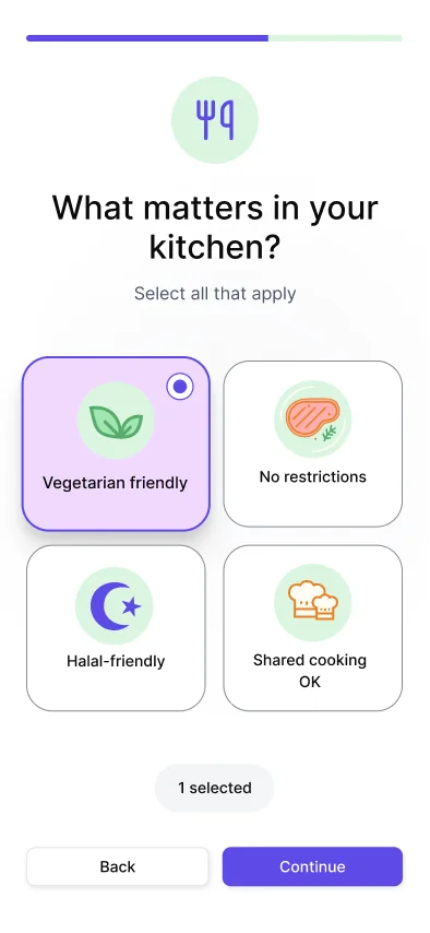
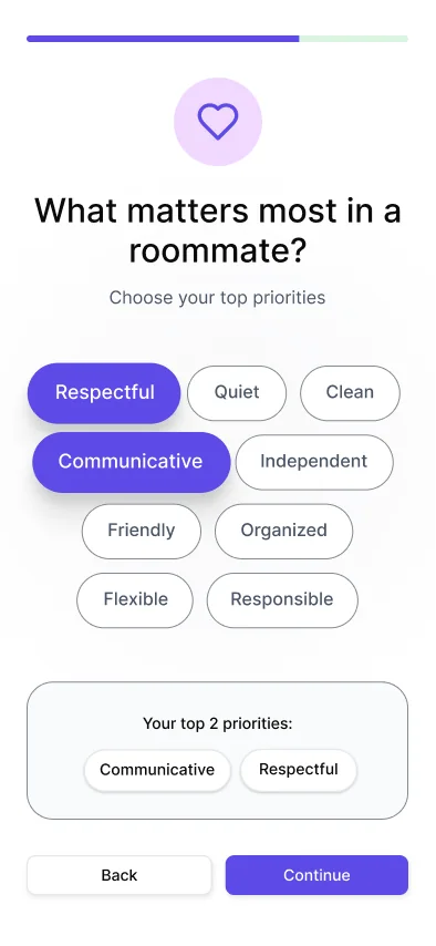
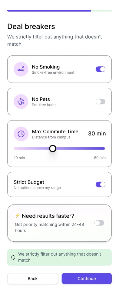
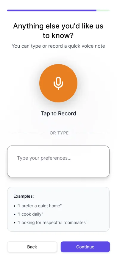
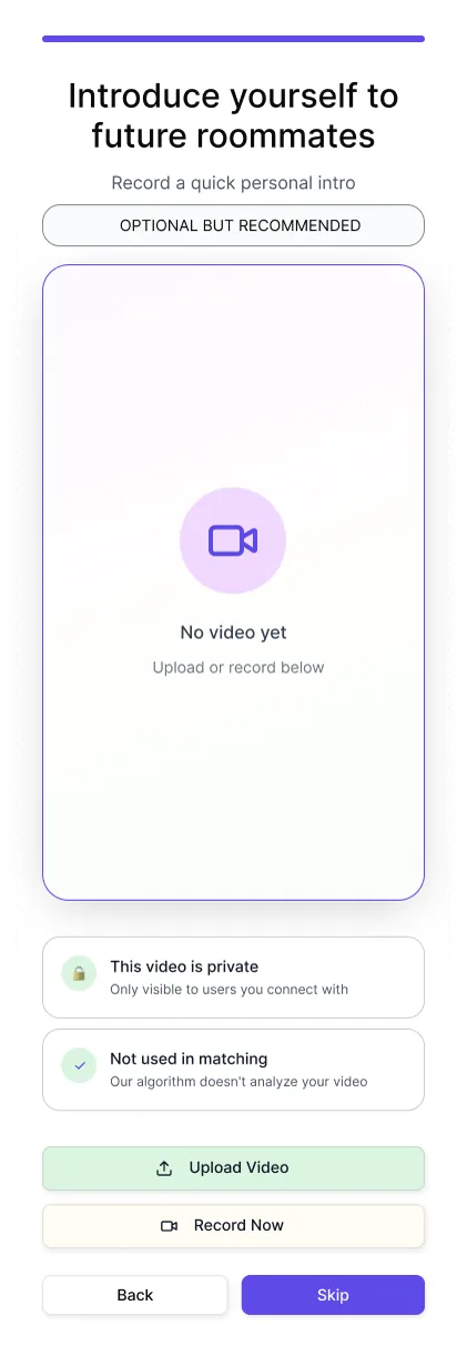
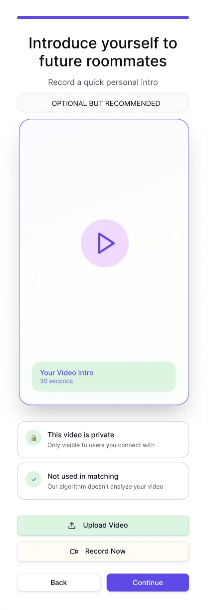
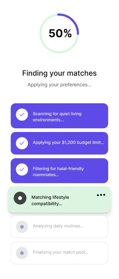
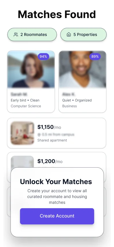
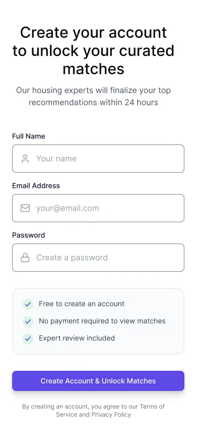
Drag either way, or step through with the arrows
Flow first, because the flow was the alignment
With the founder's vision still taking shape, the user flow was what got everyone agreeing on the same product before any UI began.
Scope
Framed around user-flow design from existing research. Roughly 80% design, 20% build.
Audit and brief
Platform reviewed against the concierge positioning. Deliverables set: flow, wireframes, UI.
Personas and alignment
Discovery data handed to design so personas came from real demographics. A three-way founder call locked the flow.
Grayscale wireframes
Structure resolved without color. Layouts pushed past the defaults: unconventional sliders, overlapping shape-and-photo treatments.
Client review
Prototype approved first round. Revisions were refinements: boxing the optional label, reordering questions, pulling back gradients.
Handoff
Screens finalized and handed to development with UI reference for build.

What actually changed
A long form people had to type their way through
Screen after screen of free-text fields. The client called the intake fatiguing, and it was costing SphereHub users before the product ever got a chance to prove itself.
Three text fields in the whole flow
Sliders, chips and multiple choice. The format changed, not the scope of what was asked.

"Carson did a great job translating our users' needs into a clear and thoughtful experience."Hamza Umar, Founder, SphereHub